Lorde Album Cover Art: A Visual Journey Through Her Eras
- Introduction: Unpacking the Symbolism in Lorde’s Album Art
- Pure Heroine: Minimalism and the Teenage Gaze
- Melodrama: Capturing the Chaos of Coming-of-Age
- Solar Power: Embracing Joy and the Natural World
- Virgin: A Raw and Intimate Look at Femininity
- The Evolving Visual Identity of Lorde’s Album Covers
Lorde album cover art is more than just packaging; it’s a deliberate visual extension of her music and evolving artistic identity. As a long-time admirer of Lorde’s work, I’ve always been fascinated by how her album covers capture the essence of each era. From the stark simplicity of her debut to the vibrant energy of her later releases, each cover tells a story. In this article, we’ll explore the symbolism, inspiration, and impact of Lorde’s album covers, delving into how they reflect her journey as an artist and connect with listeners worldwide.
Pure Heroine: Minimalism and the Teenage Gaze
Released in 2013 when Lorde was just 16, the Pure Heroine album cover is strikingly minimalist. It features her stage name and the album title in simple white lettering against a plain black background. This deliberate simplicity, or minimalism, was a bold statement against the often-flashy aesthetics of pop music at the time. It felt like she was letting the music speak for itself, focusing on the raw, introspective lyrics that resonated with a generation of teenagers. My own experience with this album involved countless hours listening in my bedroom, feeling seen by her honest portrayal of suburban life and adolescent angst. The cover, for me, represented the quiet intensity of those feelings.
Some interpret the black and white as a commentary on class status, a theme prevalent in the album’s lyrics, such as in “White Teeth Teens.” Lorde’s modest upbringing gave her a unique perspective on wealth and inequality, which she channeled into her music and, arguably, its visual presentation.
Interestingly, there was also a sense of mystery around Lorde’s identity at the time, and the cover’s lack of a prominent image of her face contributed to this intrigue. It allowed the focus to remain on the music and the themes explored within *Pure Heroine*.
Melodrama: Capturing the Chaos of Coming-of-Age
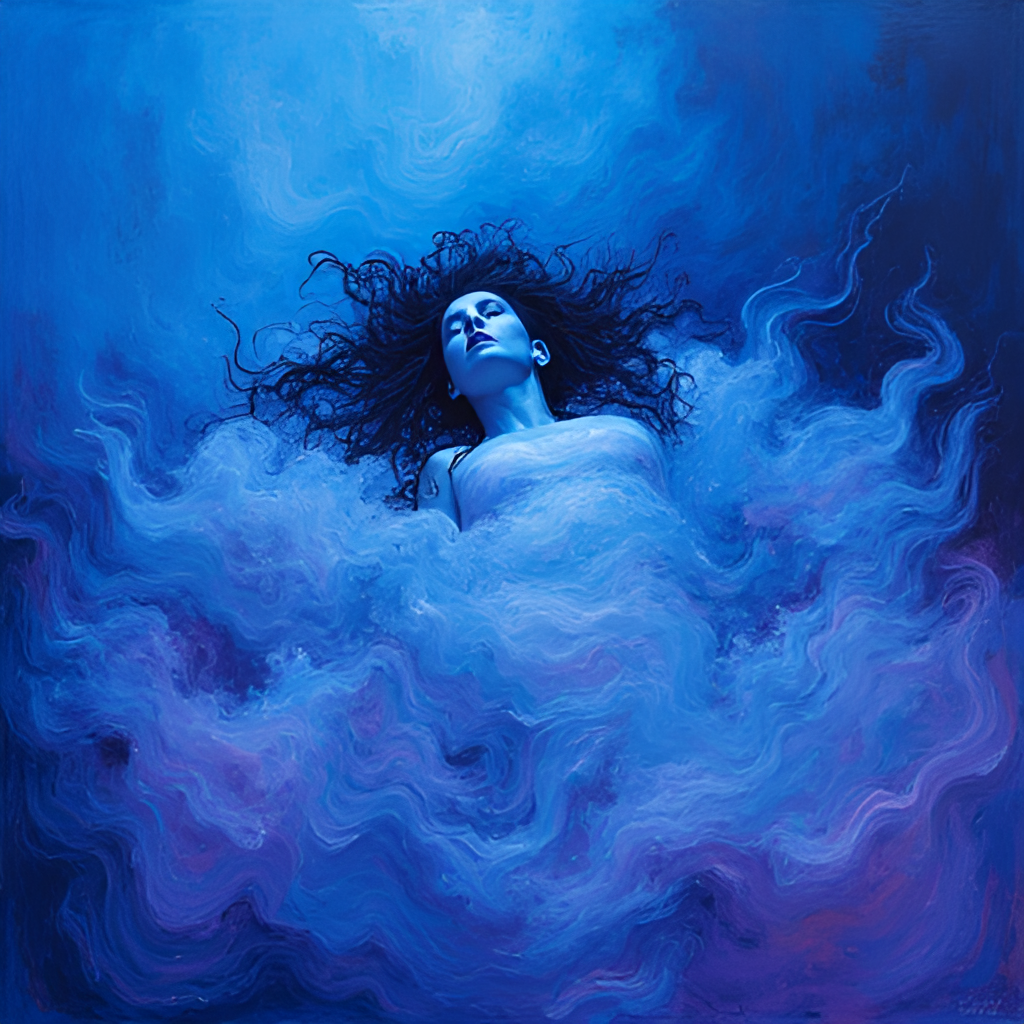
Fast forward to 2017, and Lorde’s sophomore album, *Melodrama*, arrived with a drastically different visual identity. The Melodrama album cover is a vibrant, almost chaotic painting by artist Sam McKinniss. It depicts Lorde lying in bed, surrounded by a swirl of electric blues and warm light, capturing the emotional intensity and themes of a wild night out and the subsequent introspection.
McKinniss was inspired by a photograph he took of Lorde in a friend’s apartment, and Lorde reportedly connected with him after seeing his work, which included a portrait inspired by Prince’s *Purple Rain* cover. The painting’s dramatic lighting and vibrant colours perfectly encapsulate the album’s exploration of heartbreak, parties, and the messy, exhilarating journey of emerging adulthood.
For me, the *Melodrama* cover felt like a visual representation of the emotional rollercoaster the album takes you on. The mix of colours and the sense of being caught in a moment really spoke to the album’s themes of intense feelings and self-discovery during young adulthood.
This image is a fictional image generated by GlobalTrendHub.
Solar Power: Embracing Joy and the Natural World
In 2021, Lorde returned with *Solar Power*, and its album cover caused quite a stir online. The Solar Power album cover features a low-angle shot of Lorde jumping over a friend on a beach, with the sun creating a halo effect around her. It’s a joyful, carefree image that instantly conveys the album’s themes of summer, nature, and shedding the burdens of fame.
Lorde herself described the photo, taken by her friend Ophelia Mikkelson Jones, as “a little hardcore” but also “joyful, innocent, playful, and a little bit feral and sexy.” She’s acknowledged that the image, which prominently features her backside, was a deliberate choice to represent freedom and exuberance.
The cover art for *Solar Power* is a stark contrast to her previous albums, reflecting her shift in focus towards the natural world and finding peace away from the spotlight. It even sparked some debate and was censored in certain regions, which Lorde addressed with her characteristic candour.
I remember seeing the *Solar Power* cover for the first time and being struck by its sheer happiness. It felt like a breath of fresh air, perfectly matching the album’s laid-back, sun-drenched vibe. It’s a bold statement, for sure, but it entirely fits the mood of the music and where she was at that point in her life – embracing simpler joys.
Virgin: A Raw and Intimate Look at Femininity
Lorde’s recently announced fourth album, *Virgin*, continues her pattern of using striking and symbolic album art. Set for release in June 2025, the Virgin album cover is perhaps her most intimate and thought-provoking yet. It features an X-ray of a pelvis, overlaid with a belt buckle, zipper, and what appears to be an IUD.
Lorde has described *Virgin* as an album written “100% in blood,” aiming to reflect her femininity in a raw, primal, and openhearted way. The X-ray imagery suggests a stripping away of external appearances, offering a visceral and unsentimental look at the internal self and the female body. This is a powerful artistic choice that invites a deeper conversation about identity and vulnerability.
As someone who has followed Lorde’s career, the *Virgin* cover feels like a natural progression – a move towards even greater honesty and a willingness to explore complex themes through her art. It’s a bold statement that aligns with her history of using her lorde album cover art to challenge expectations and spark discussion.

This image is a fictional image generated by GlobalTrendHub.
The Evolving Visual Identity of Lorde’s Album Covers
Looking back at Lorde’s album covers – *Pure Heroine*, *Melodrama*, *Solar Power*, and now *Virgin* – it’s clear that each one represents a distinct chapter in her artistic evolution. From the minimalist statement of her debut, which captured the essence of suburban adolescence , to the vibrant portrayal of coming-of-age drama , the joyful embrace of nature , and the raw intimacy of her latest work , each cover is a carefully considered piece of art that complements and enhances the music within. Lorde album cover art consistently challenges norms and invites viewers to look deeper, much like her lyrics do. It’s this thoughtful approach to her visual identity that makes her one of the most compelling artists of our time.